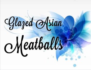
 Another one of those fiddly things that I do. I’m giving it its own post. If you’re just hosting a small gathering you can do the handwritten folded-in-half card, although for a small event you probably don’t need the signs in the first place. For anything serving over, say, 25-30 people, and definitely if you’re serving the masses, menu signs are very helpful. People really seem to appreciate them. You can just write the item’s name and any descriptive words (“vegetarian,” “gluten-free,” etc.) on a blank 3 x 5 card with a Sharpie, or you can go all fancy and do it on the computer, even adding graphics, even adding graphics that match the color scheme of the event. (I often get my son or husband to do the graphic design and printing for me.)
It’s a good idea to have the signs printed on two sides, the process of which can be rather frustrating if you don’t fully understand the vagaries of your printer. Since I’m often managing events that have duplicate serving tables, I just do two of each sign, in landscape mode, two on the top of the page and two on the bottom, and then I don’t have to worry about flipping the images for the second side. Actually, now that I think about it, I can just do two-sided printing, making a copy of that first page for page 2, if I’m doing the duplicate signs. (If you don’t want to do this yourself, get someone to read this and then do it for you.) So the illustration given is from a big wedding reception, and the bride’s colors were, obviously, drawn from the blue palette. I did ask about what specific blues she was using and then went onto Pixabay (a free image service that I use all the time; there are others out there) and searched for something like “blue background” under “illustrations.” I like the one shown here; you have to put a text box over the image in order to have the two-layer effect. Again, get someone to do this for you if you don’t know how yourself. Or, if you don’t want to bother with all this, you can just make your font appropriate in style and color. (Take a look at the fonts available already on your computer; the one shown is something I purchased but there are many sites online for free fonts.) I freely admit that all of this design work is completely unnecessary and that I do it mainly because I enjoy it so much. Just don’t leave it until the last minute! Then the task becomes decidedly unenjoyable.
You want to have signs that are easily seen, so some kind of stand or holder is very helpful. I started out with a dozen, and there have been times when that wasn’t enough–if I had duplicate serving tables and was serving more than six different items I’d be over the limit. So I got another set. These are often called “table number holders”–if you buy something called “menu holders,” they’re usually too small/short to be useful. I think those are designed to be used on individual tables, but you want your signs to be easily read as people move through the line, especially if it’s an event at which the lights are somewhat dimmed, as they may be at an evening party. The shopping below link is to the 12″-high ones–you need that amount of height for visibility. These are not as heavy-duty as my first set, but they’re perfectly adequate: Using the nice clear signs and the holders that make it easy for people to see them help fulfill some of the principles I outlined in the hospitality post from last time: Give the people what they want and need. They will be so appreciative!
This post contains affiliate links. If you click the link and buy the product, I will receive a small commission at no additional cost to you.